Mithun Shanbhag
blog | twitter | linkedin | github | insta

Quick links
Befores and afters
Published on 09 Nov 2026 by Mithun ShanbhagThe simplest way for a brand to tell a story is to show a before and an opposite after, with the brand effecting that change.
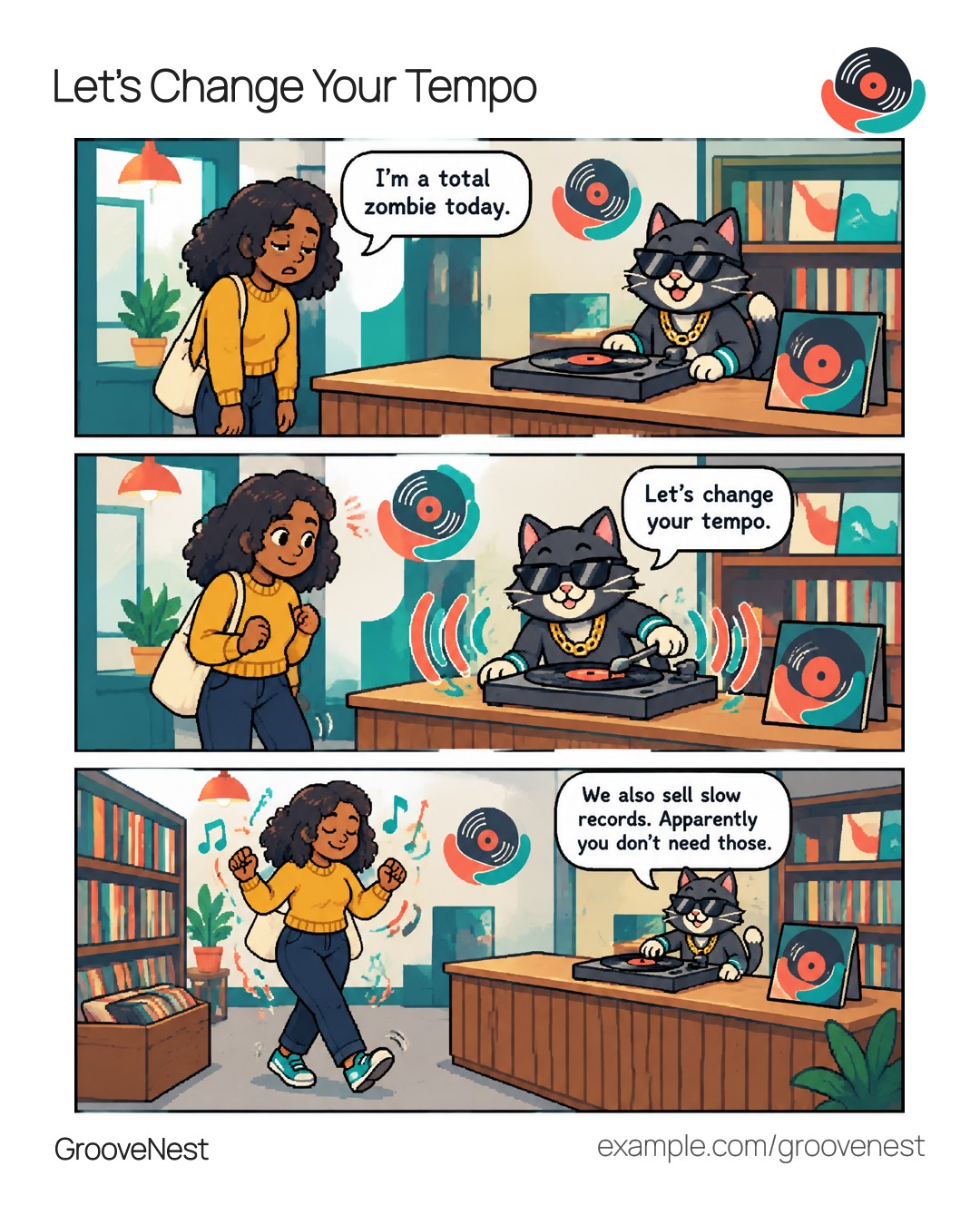
Let’s create a simple “before vs after” story for a fictional local neighborhood record store, ‘GrooveNest’.
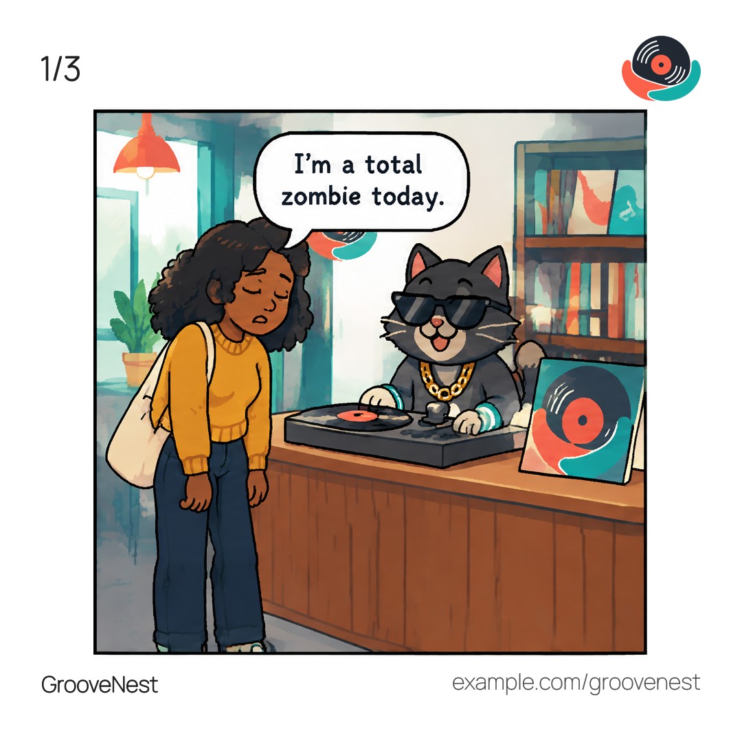
With short illustrated stories, there is no time for exposition. The first panel must set the stage; it should visually depict the main character(s) in a distressed or less-than-ideal state. In this example, our sleep-deprived subject is clearly feeling lethargic and groggy.
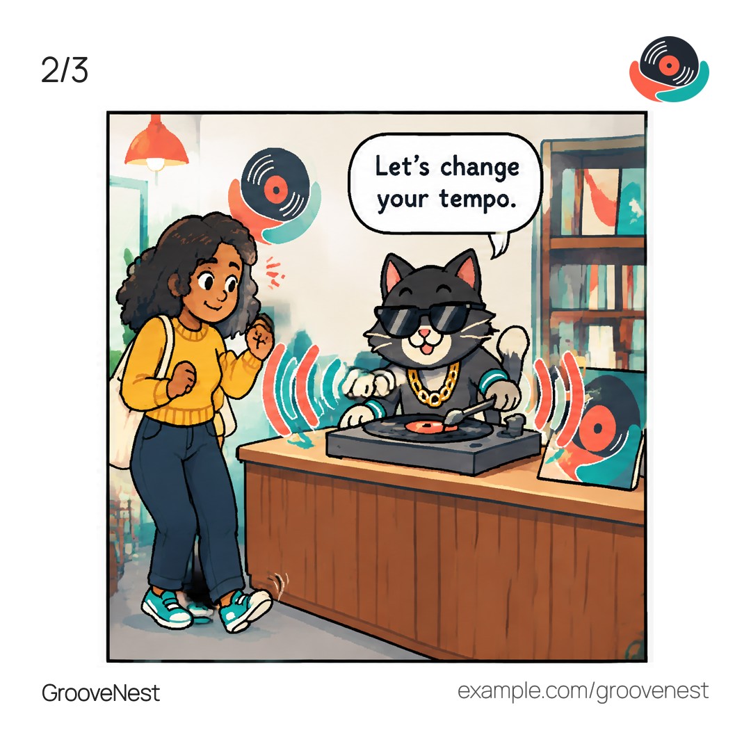
The second panel does the switch/transition. This is usually where the brand comes in to save the day. The brand mascot, Rory, plays upbeat music to lift the room’s tempo. The subject starts tapping her foot to the music.
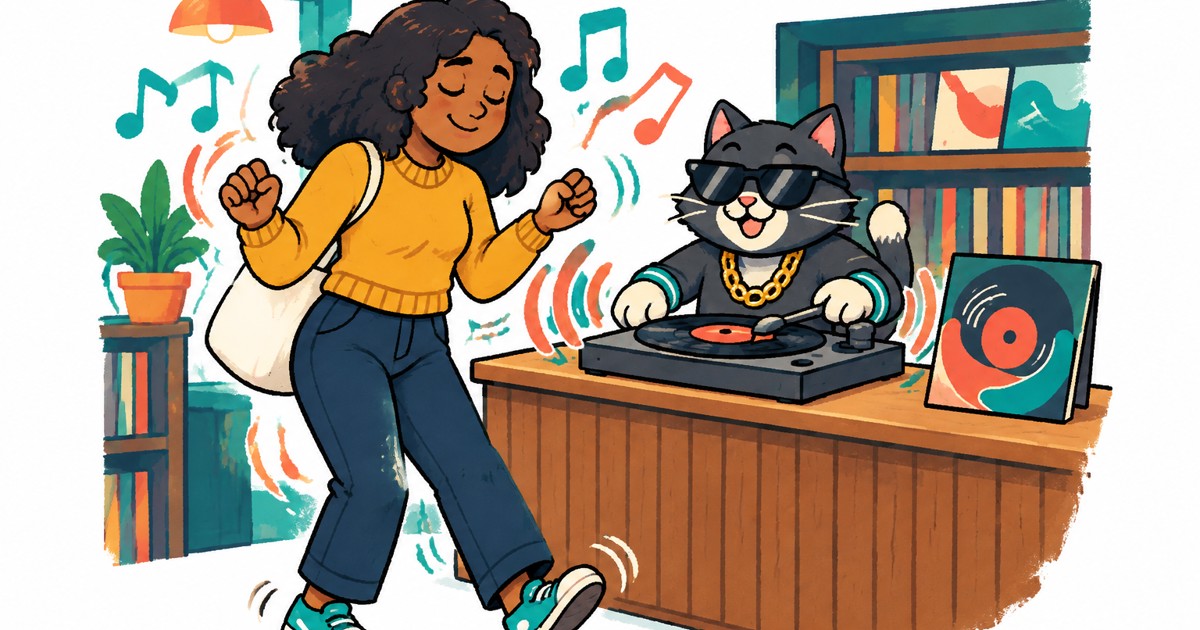
The third panel is the payoff. The subject is now in a significantly better mood. Mission accomplished!
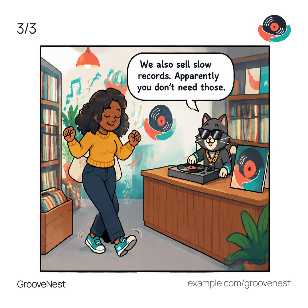
Honestly, this comic strip doesn’t need dialogue or speech bubbles. Technically speaking, even the mascot isn’t really needed in these scenes. But mascots and embossed logos help readers recall the brand instantly.
What’s the “before vs after” that YOU strive to create for your customers? And how do you help them visualize it?
#branding #storytelling #visualstorytelling #visualbranding #comicfire comicfire.com